Content Matrix
Designing a shared framework to bring consistency, clarity, and scalability to Drinkaware's 200+ content pages
Organisation: Drinkaware
Role: UX Designer
Overview
Drinkaware's website had over 200 content pages maintained by multiple teams and no shared standards for structure, components, or how users were guided through content. I designed a Content Matrix framework to fix that, delivered it across two parallel tracks to work within real constraints, and have so far applied it across 44 pages.
The problem
Drinkaware's content pages were maintained by multiple teams and nobody owned the overall experience. Without clear ownership, there were no shared standards for page structure, components, or how users were guided through content. The result was a site where individual pages might work locally but the overall experience was inconsistent and difficult to navigate.
The issues were systemic rather than page-level:
Page layouts and components varied significantly across different areas of the site.
CTAs were inconsistent and difficult to apply at scale.
Onward journeys were unclear, making it hard to guide users toward key tools and services.
CTA hierarchy and engagement patterns were uneven and difficult to apply consistently.
Reporting on performance relied on manual processes, limiting the team's ability to iterate.
Making anyone take notice or take action was difficult, the problem was too diffuse to point at, and too complicated to fix without a shared framework that everyone could understand and use. This was the gap the Content Matrix was designed to fill.
Contextual challenge:
This work was delivered in parallel with other major initiatives (a digital content review and large-scale content audit), rather than as a single joined-up programme, increasing the complexity of alignment and delivery.
Discovery stage
In order to bring together previous work and get a comparative overview of the website instead of anecdotal evidence, I:
Conducted a structured review of seven areas of the website, documenting differences in banners, breadcrumbs, navigation, CTAs, and engagement components.
Drew on existing user journeys and service blueprint from previous projects to understand how content supports progression across the platform.
Identified that many issues were systemic rather than page-level, driven by a lack of shared standards rather than isolated UX problems.
Competitor analysis
I carried out a competitor analysis across organisations delivering complex advice and information content. I focused on reviewing layout consistency, CTA patterns, engagement components, and onward journey structures.
Key insights:
Competitors used more consistent layouts and clearer CTA patterns to set user expectations.
Onward journeys offered fewer, more deliberate options.
Engagement components were used selectively to support long-form content without increasing cognitive load.
Opportunity identified:
A standardised approach to page structure and component usage would improve clarity and consistency, and provide a stronger foundation for managing onward journeys over time.
The framework
I designed a Content Matrix framework to define three things across every content page:
Core page components
CTA hierarchy (primary, secondary, tertiary)
Usage guidelines aligned with brand and accessibility standards
Recommendations included:
Standardising banners and breadcrumbs
Reducing reliance on excessive hyperlinks
Reviewing the use of side navigation
Improving how CTAs were described and presented
Not everything could be actioned immediately, some changes were constrained by CMS limitations. The priority was establishing consistency using existing components first, with future component development identified as a next step.
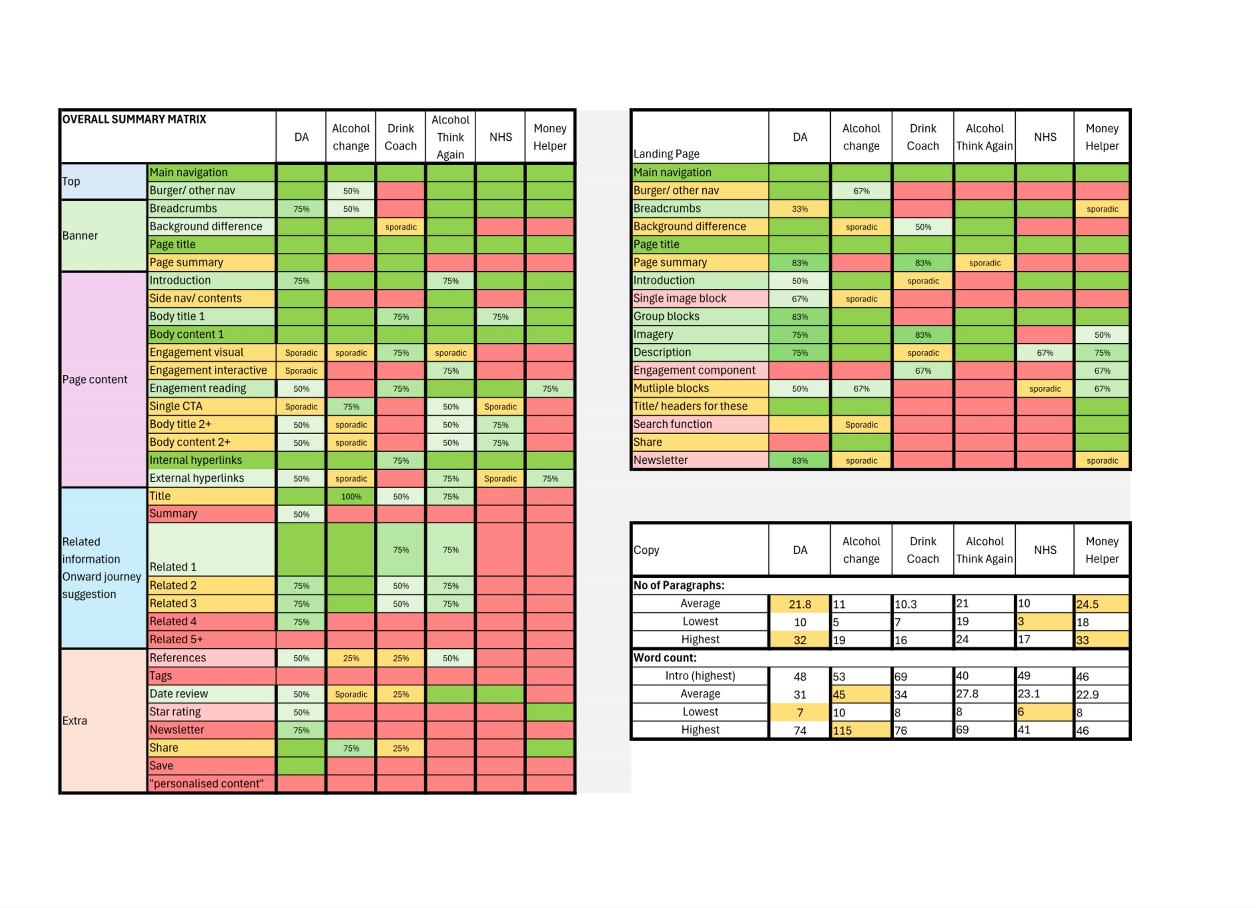
Competitor analysis scoring

Page blueprint

Example of updated page
Delivering within constraints
This project ran in parallel with a digital content review and a large-scale content audit, all separate workstreams rather than a joined-up programme. To make steady progress without being blocked, I split delivery into two tracks:
Full UX/UI and content review
Applied Content Matrix principles during full page reviews, updating structure, components, and content. Required coordination with content owners and longer approval cycles.UX/UI component review only
Focused on visual and structural updates using existing components, with minimal content changes. This enabled a faster roll-out, while still improving consistency.
Page selection across both tracks was often influenced by other concurrent projects rather than UX priorities alone, which required careful coordination to avoid duplication of effort and keep the work moving.
Outcome and next steps
44 pages updated so far, with rollout continuing across priority areas. The framework established a shared set of standards for page structure, component usage, and CTA hierarchy that didn't exist before. With significant website improvements planned for 2026, it provides an important foundation for the next phase of work.
Performance and engagement data will be reviewed three months post-update to inform what comes next, including mobile consistency, navigation, and potential personalisation.
Reflection
The dual-track delivery approach was the key decision on this project. Waiting for perfect conditions (a single joined-up programme, full CMS capability, aligned timescales) would have meant waiting indefinitely. Splitting the work allowed real progress while keeping the bigger picture in view. It also taught me a lot about how to coordinate design work across teams with different priorities and timelines, and how to maintain quality without making the perfect the enemy of the good.