User Journeys- Part 2
Testing and Implementation
Goal of overall User Journey project:
To introduce an overarching methodology that strategically guides users—regardless of their initial entry point—toward completing the digital AUDIT tool on the Drinkaware website.
Organisation: Drinkaware
My Role: Junior UX Designer (Project Lead), supported by the UX Designer, Product Owner, and Content Lead
About the AUDIT Tool:
The Alcohol Use Disorders Identification Test (AUDIT) is a screening tool developed by the World Health Organization (WHO) to identify potential alcohol-related problems. Drinkaware offers a digital version of this tool, enabling users to assess their drinking habits and receive a personalised risk level.
Goals and Objectives
Building on earlier journey-mapping work, this phase focused on testing real-world journeys using live content, identifying ways to reduce drop-off and improve flow. We aimed to demonstrate that small UX changes- made without additional development input- could meaningfully improve engagement.
Introduce a consistent methodology for directing users toward the AUDIT tool.
Reduce bounce and exit rates by offering clear onward journeys from high-traffic pages.
Map and implement two user journeys using real content with minimal development support.
Lay the groundwork for future optimisation of AUDIT tool completion rates
Challenge
Although I had created a high-level journey template, the challenge was translating this into testable, content-driven experiences.
How do we select the most appropriate content for each stage of the journey?
How do we connect these pages in a way that feels seamless and user-centred, rather than forced?
A further complication was the Unit & Calorie Calculator (UCC), a key page in the journey. Its result page includes onward journey suggestions that are hardcoded into the tool, meaning they couldn’t be edited for testing. This limited how much control we had over the user’s next steps.
Additionally, with no content or communications lead in post at the time, updating or rewriting content wasn’t an option- forcing us to work only with what was already live on the site.
Discovery
In Part 1 of the User Journey project, I had:
Developed a journey-mapping template to structure user flows toward the AUDIT tool
Identified three core entry points users take into the site:
Knowledge Hunter
Self Improver
Something is Wrong
Now I focused on the Knowledge Hunter and Self Improver journeys, as they were longer and presented more opportunities for refinement. I created two proto personas to add depth and to highlight goals and opportunities. This helped identify key themes for their user journeys.
Research
I cross-referenced the three entry points with relevant content types and identified 15 distinct journey variations.
Although the “Something is Wrong” path wasn’t selected for testing, I included it to understand overlap and ensure consistency across journeys.
I then mapped each journey using live content pages and added performance data from Google Analytics (including entry, exit, and bounce rates). This process gave me a detailed view of how users currently navigate the site and revealed clear opportunities to improve flow and retention.
Design
I proposed testing the Knowledge Hunter journey, as it’s a top-of-funnel pathway that draws significant traffic.
I built a test-ready user flow using existing content.
I ensured each journey step was cross-referenced against the mapping to consider overlapping paths.
To work around constraints with the UCC tool, I created a dummy version of the page. This allowed me to simulate the full journey without requiring back-end changes.
Crucially, we made no changes to page layout or content. At the time, there was no dedicated comms or content person in post, which meant we had limited capacity to update pages. As a result, this version of the test focused solely on journey structure. While we recognised this would cap potential improvements, it provided a low-risk way to begin validating the approach and laid the groundwork for future iterations.
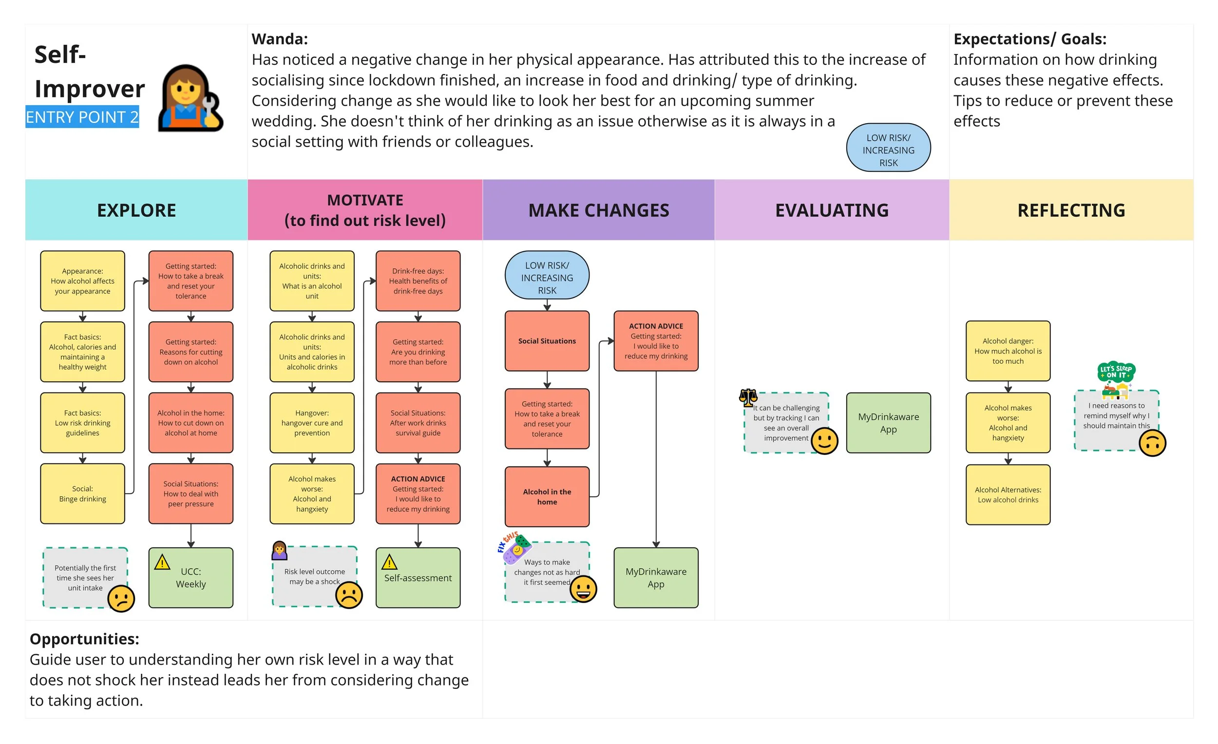
Proto-persona: Self-Improver

“Knowledge Hunter” journeys mapped out

Testing summary
Next steps
Although two test-ready journeys were developed, we did not proceed to live testing. It was agreed that the use of a dummy “Unit and Calorie Calculator” page would not accurately represent the real tool experience and could risk distorting the established tracking setup.
Additionally, broader issues emerged around content quality and consistency across the website. With no content or communications lead currently in post, the decision was made to pause implementation until someone was in role who could help improve the content alongside the user journey work.
This foundational work remains ready to pick up and test when the right support is in place, with mapped journeys, performance baselines, and next steps already defined.