User Journeys- Part 1
Understanding our current user journeys
Goal of overall User Journey project:
To introduce an overarching methodology that strategically guides users- regardless of their initial entry point- toward completing the digital AUDIT tool on the Drinkaware website.
Organisation: Drinkaware
Role: Junior UX Designer (Project Lead), supported by the UX Designer, Product Owner, and Content Lead
About the AUDIT Tool:
The Alcohol Use Disorders Identification Test (AUDIT) is a screening tool developed by the World Health Organization (WHO) to identify potential alcohol-related problems. Drinkaware offers a digital version of this tool, enabling users to assess their drinking habits and receive a personalised risk level.
Problem/ Challenge
The Drinkaware website was originally structured as an information resource- users came for advice or facts, then left.
However, the organisation aimed to evolve into a platform that encouraged deeper engagement, leading users to tools like the digital AUDIT. And it was anecdotally seen that users wanted this also in our analytics data.
Challenges included:
No user tagging or risk categorisation until users completed the AUDIT tool
Over 100 separate content pages, making the navigation path complex
No existing user personas to segment or tailor content journeys
A successful journey was redefined as one that culminated in the user completing the AUDIT tool and receiving a risk assessment.
Research
To understand how users currently moved through the site, I conducted a quantitative analysis using Google Analytics:
Tracked onward journeys from the homepage.
Analysed top search queries to identify user intent.
Reviewed metrics for the top performing 25 pages.
Examined digital tools to track user sources and destinations.
Findings:
Journey loops, where small groups of content keep linking to each other, were present in the top onward journeys. This made it difficult to identify patterns because I was analysing data at quite a granular level.
Overwhelming Volume: The large number of pages made it difficult to see clear patterns at the individual page level
To extract meaningful insights, I would need to reframe how content was grouped and analysed.
Ideation/ Strategy
To make sense of the website's content structure, I introduced new structural definitions to reveal higher-level patterns in user behaviour (see images above):
Sub-categories: I created a middle layer between parent pages and individual content pages. For instance, under the parent page "General Health Effects", which included 15 child pages, I grouped content into smaller sub-categories for clearer analysis and journey mapping.
Content types: I added nuance by distinguishing between different types of Fact and Advice pages. This helped in defining the purpose of content blocks—e.g. whether they were informative, action-oriented and shaped how they were used in user journeys
Mapping User Journeys (using Google Analytics):
For each sub-category, I identified the top 3 next-page destinations
I then continued linking pages based on the top 3 next-page destinations, building out each journey until users reached either:
The Unit and Calorie Calculator (an interim engagement point)
The digital AUDIT tool (primary goal)
This approach shifted the focus away from granular, page-level transitions and instead revealed pattern-based user behaviour across content groups.
Design approach
To prototype a simplified and testable journey template, I followed a structured process:
Mapping Journey Flows
Assigned each content page to a sub-category
Used Google Analytics to identify the top 3 next-page destinations from each sub-category
Mapped user flows that continued through the site until one of two outcomes:
The Unit & Calorie Calculator (an interim step)
The Digital AUDIT Tool (primary goal)
Journey Consolidation
I grouped similar patterns across user journeys and removed unnecessary detail to develop three overarching user journeys that could be easily visualised, tested, and adapted.
Each journey:
Reflected a different entry point based on user intent
Included key decision-making moments where users might continue, loop, or drop off
Was aligned to behavioural stages from the FRAMES model (e.g. Precontemplation, Contemplation, Preparation), allowing us to consider each user’s readiness to change and tailor content accordingly
By aligning journeys with these psychological stages, I could map not only where users were going, but why—and identify the most relevant content or tools to support them at each phase.
Journey Identities
Gave each journey a clear identity, including:
Likely AUDIT risk level
Relevant content topics
Special journey paths for people visiting on behalf of someone else (e.g. a partner, friend, or family member), labelled "Help for someone else".

New structural definitions introduced at ideation stage: content groupings

New structural definitions introduced at ideation stage: key
Screenshot of mapping process

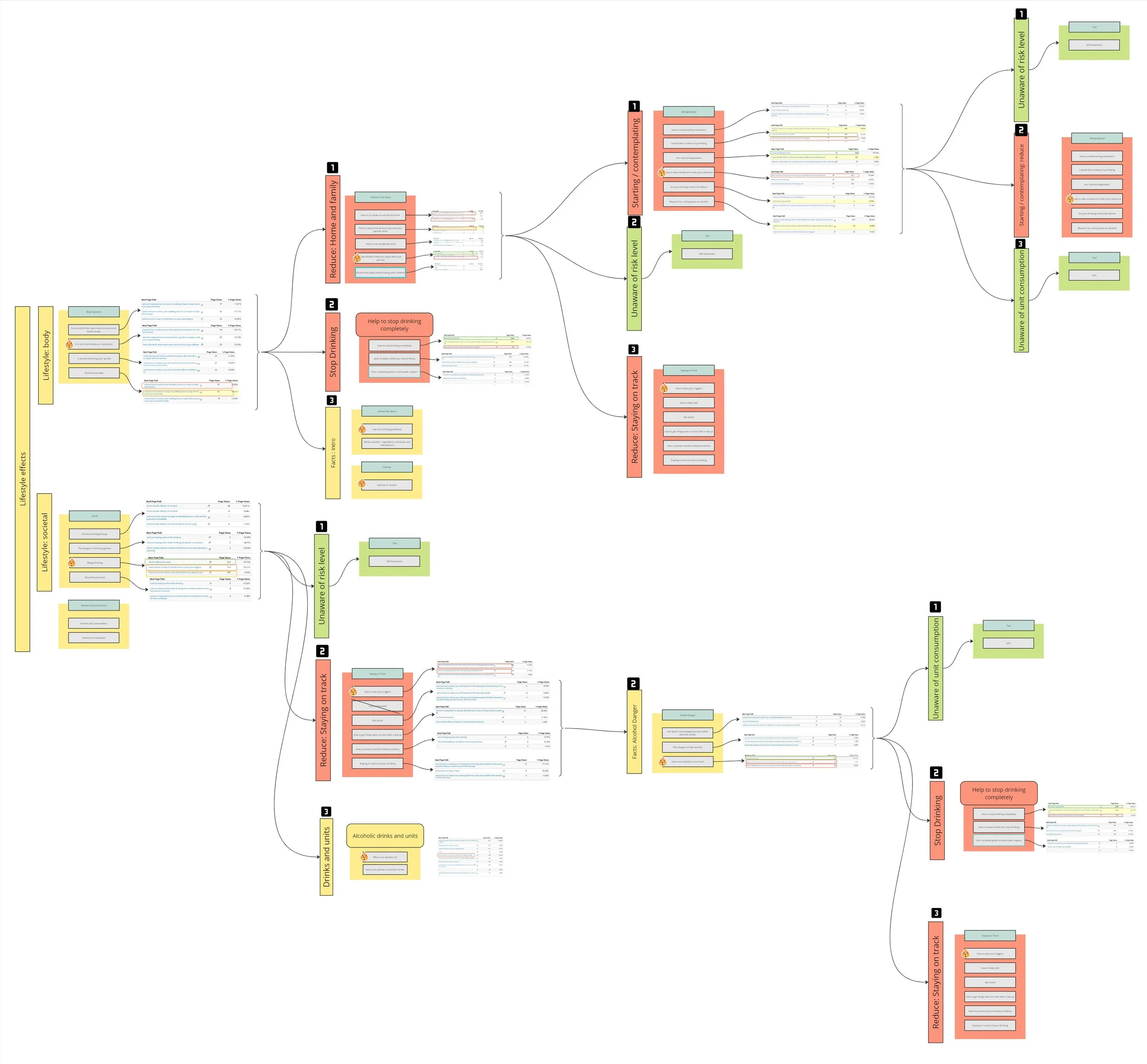
A journey showing which content users utlise to move forward and the loops within this

Working out the journey: this shows how I identified the pages that move forward and the pages that looped/ crossed.

A kay to the different page types

The mapped out journeys
Final Solution
I developed a top-level journey mapping template that captured how users progressed through the site based on their entry point, intent, and interaction with tools.
The template included:
Three primary entry routes, reflecting staggered starting points based on users’ readiness to change
Decision points influenced by whether or not a user engaged with key digital tools (like the Unit & Calorie Calculator or AUDIT tool)
Parallel paths to represent people visiting on behalf of someone else (e.g. a partner, friend, or family member), labelled "Help for someone else". While these users often follow the same routes as direct users, their mindset, goals, and decision-making are different. They may not align with models like FRAMES, but it was important to visually represent their journeys to ensure their needs weren’t overlooked during design or testing.
Rather than defining fixed end goals, this framework focused on the early and middle stages of the user journey- helping us understand where users were coming from, how they moved through content, and where strategic interventions could improve engagement.
The mapping template can be used to apply real content, simulate realistic journeys, and support iterative testing, making it a flexible tool for identifying gaps and refining content strategy.