LMS & E-learning: Alcohol Education
Designing and delivering Drinkaware's first e-learning modules for partner organisations; learning two new tools from scratch, solving a complex technical display issue, and maintaining design quality under a strict timeline.
Organisation: Drinkaware
Role: UX Designer
Tools: Evolve, Totara, Figma
Drinkaware's LMS (learning management system) is built on Totara, a platform that hosts and delivers online learning. The e-learning modules themselves were designed in Evolve and are SCORM files, a standard format for packaged e-learning content that can be hosted on any compatible LMS.
Overview
Drinkaware's first e-learning suite; three modules covering alcohol awareness, alcohol and wellbeing, and alcohol conversations and moderation. Designed for partner organisations including alcohol manufacturers, on and off alcohol trade, and retailers. Due to tight deadlines, this effectively became a secondment, taking priority over all other work.
The brief
Drinkaware had been delivering alcohol education to partners through individual sessions, a resource-heavy model that wasn't sustainable at scale. Partners still needed credible, accessible alcohol education, so the solution was to move that provision into a self-serve e-learning format.
The three modules were designed for deployment across partner organisations. I led the UX and visual design of the SCORMs from template setup through to final delivery, working alongside a content writer and alcohol specialist. The Senior UX Designer led on the Totara platform design.
The modules needed to work for a broad partner audience initially, with the possibility of adapting for specific organisations, and had to be designed with a future public-facing rollout in mind from the start. Partners could host the SCORM files either on Drinkaware's Totara platform or independently on their own LMS.
New tools, steep learning curve
Neither Evolve nor Totara were tools I had used before. I had to get up to speed quickly on both while simultaneously delivering to a tight deadline. A specialist was available for support, but only occasionally which meant I had to diagnose issues thoroughly before asking for help, frame problems clearly, and use that support efficiently. It was a good discipline and one that pushed me to develop genuine working knowledge of both platforms rather than relying on guidance throughout.
The design approach
Rather than designing every screen individually across 17 units, I built a master template in Evolve that established the layout, typography, component patterns, and visual style, then applied and reviewed it across each module. This kept the experience consistent while allowing content-specific adjustments where needed.
Structural decisions about how the modules would be presented kept changing during delivery. The original plan was three modules with units accessed via a module landing page. This shifted to individual unit downloads, which meant rethinking how users would move through the content and updating all visual progress indicators to reflect the new structure.
To manage this and keep on top of version control, I made the decision to maintain all modules and units as a single master course in Evolve rather than working on individual files. Any updates and edits were made to the master, with individual units then cut as SCORMs from it. This meant there was always one source of truth, which was particularly important given the volume of last-minute content changes and structural decisions made throughout the project.
As content was written and rewritten throughout the project, I regularly reviewed the components being used to ensure they remained the best fit for the finalised copy. This included optimising how components looked and behaved across mobile, desktop, and tablet. All three screen sizes were essential given that partners would be accessing the modules across different devices and working environments. What worked well in preview at one screen size didn't always translate cleanly to another, so this was an ongoing process of review and adjustment rather than a one-time task.
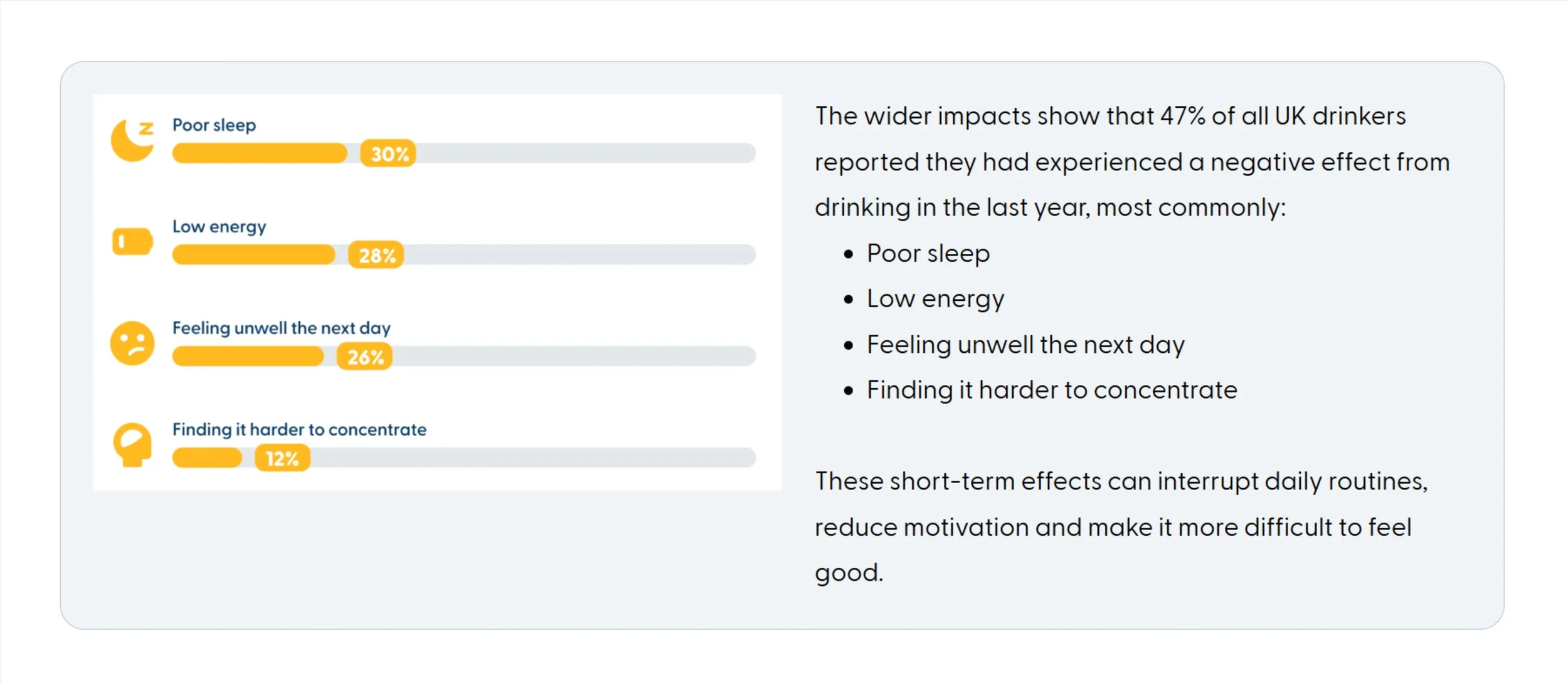
An infographic showing insights so that the accompanying copy could be reduced
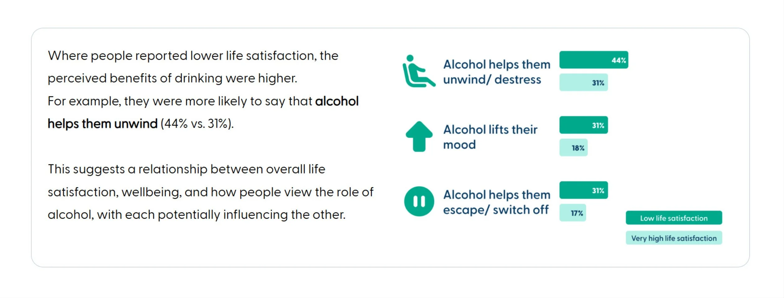
An infographic highlighting the difference between two groups of people. The visual conveys the differnce more than reading the figures alone.
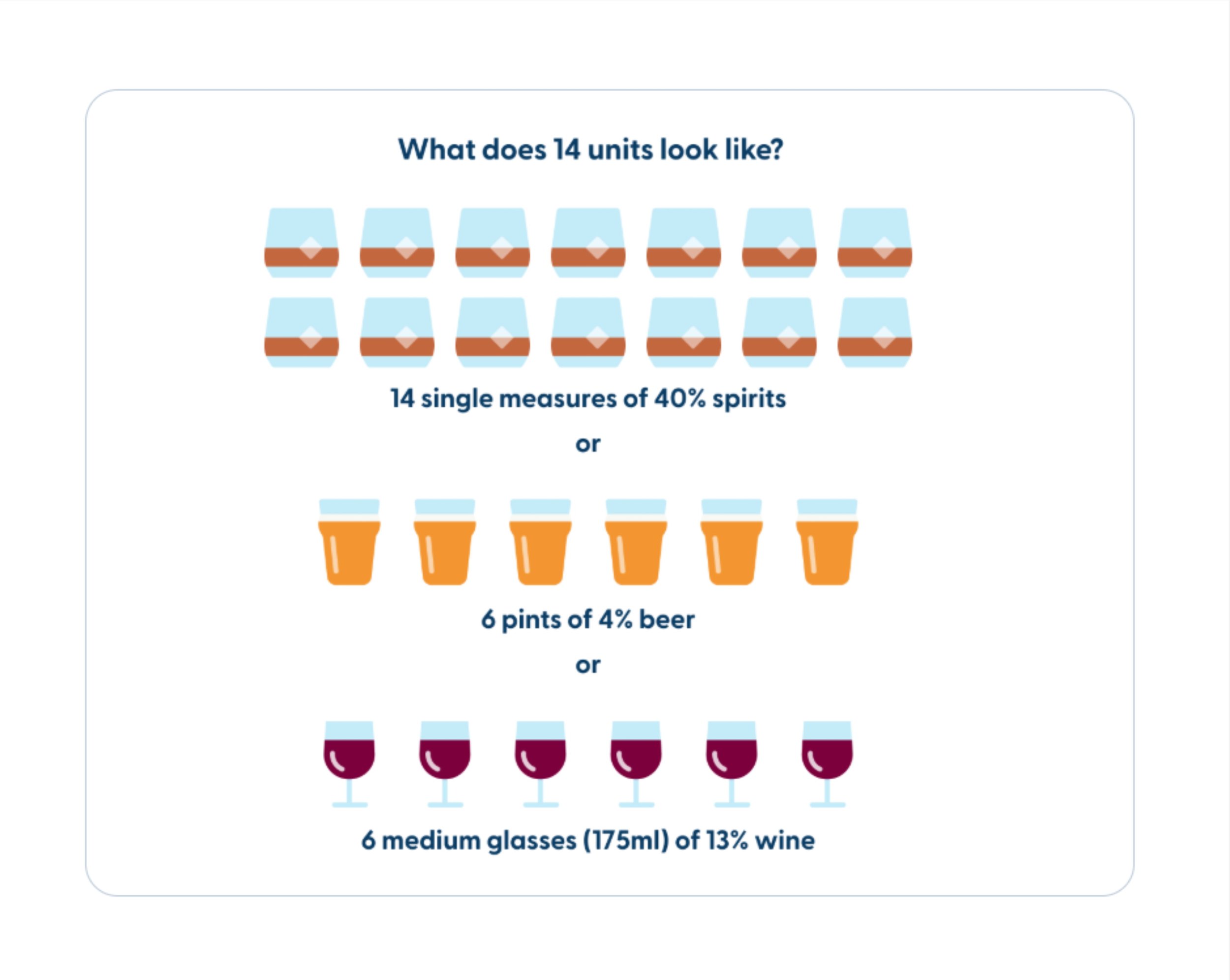
Visualising what 14 units looks like (the CMO's low risk guidelines limit)
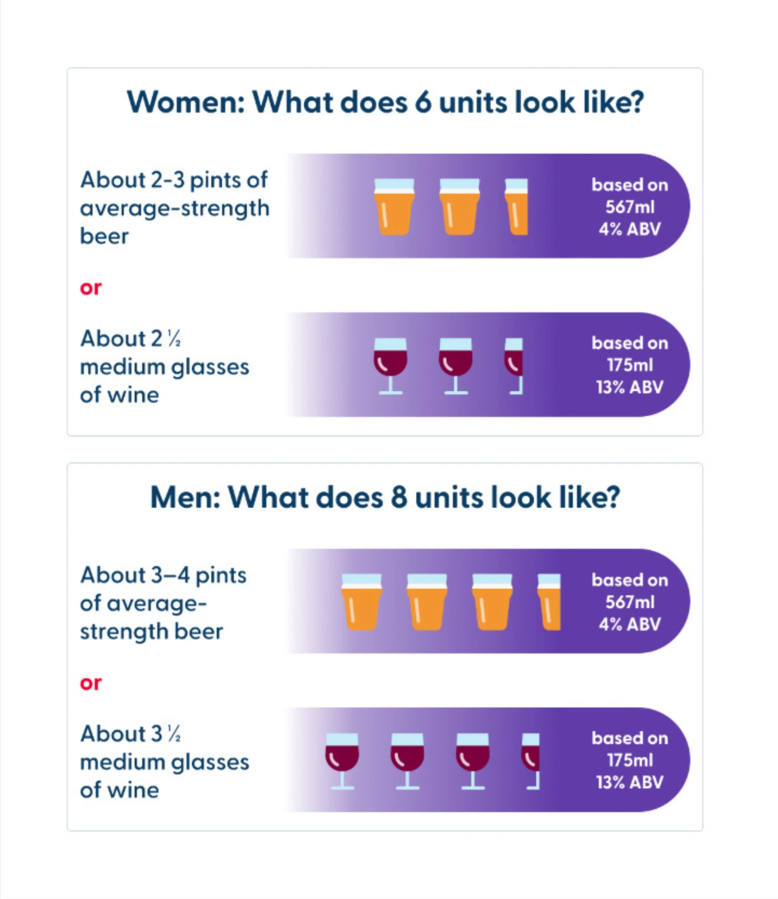
Visualising binge drinking limits for men and women
Imagery and pictograms
I sourced imagery and pictograms from within Drinkaware's existing library, but the volume of new content meant there were significant gaps that needed filling. Ordinarily this work would be handed to an external design agency, but the tight timeline made that impossible. Instead I drew on Drinkaware's design style and existing alcohol education materials for inspiration and designed the pictograms, infographics, and supporting visual elements myself, illustrating alcohol units, health effects, and key statistics.
Where data needed to be communicated clearly, I created infographics to make figures meaningful rather than just presenting numbers. Every visual was reviewed for accuracy with relevant stakeholders.
A pictogram to accompany "How the body processes alcohol"
A pictogram for the 14 unit limit section of the CMOs guidelines
Pictograms to accompany different moderation methods
The SCORM framing issue
The most technically complex challenge was getting the units to display correctly once uploaded to Totara. Originally, the SCORMs would open in their own window once launched from Totara, so they had been designed and optimised for this using Evolve's preview. However due to some feedback following user testing, a decision was made to present the SCORMs within the same page as a frame within a frame. Now when uploaded to Totara, excess padding and margins created display problems across screen sizes.
This was particularly a big issue for an embed of Drinkaware’s Drinking Check tool. The underlying widget couldn't be adjusted as it was used elsewhere across Drinkaware’s digital estate. I worked through the problem systematically: first adjusting the embed iframe to resolve the desktop display issue, where the content was filling the full page width and preventing the full widget from being visible. Once that was resolved, the Totara upload revealed a deeper issue, the additional padding from the nested frame structure was compressing the content further. I had to go into the Evolve theme and adjust the global padding and margin settings to resolve it.
It was a problem that only became visible at the upload stage, not something that could have been caught in preview and resolving it required understanding both how Evolve outputs SCORM files and how Totara renders them within its page structure. To resolve this, I had to liaise with the head of digital, and our dev agency who are responsible for the widget, as well as the Evolve expert.
Late-stage references
References were added late in the process, a last-minute requirement that meant revisiting reviewed and completed units. Beyond the editing workload, it raised a genuine design question: how to present academic references in an e-learning context without disrupting the flow or overwhelming users who don't need that level of detail. I worked through the options and designed a solution that made references accessible without making them intrusive.
Accessibility
Accessibility is central to my design process, from managing cognitive load to ensuring colour contrast, keyboard navigation, and inclusive interaction patterns are built in from the start rather than audited after the fact. Although I was taught accessibility theory during my UX training, I have found the most effective way to keep that knowledge current is to follow how it evolves alongside technology. I have attended Axe-con annually, which has given me real insight into the challenges users face, emerging ways to address them, and concrete examples of how organisations are doing this well.
When approaching the accessibility requirements for the LMS, I was conscious that time had passed since I had engaged deeply with the specifics, so rather than assuming my existing knowledge was sufficient, I researched current best practice before proceeding.
In practice this meant:
For interaction design, I learned how Evolve's interaction label feature worked and made sure it was present for every interactive element. I reviewed all language used throughout the modules, avoiding terms like "click" in favour of device-neutral alternatives.
For imagery, I applied alt text carefully and contextually. Repeated images were given empty alt tags so screen reader users weren't given the same description multiple times. For infographics where the surrounding copy already described the visual, I avoided redundant alt text. For pictograms, I considered each one individually, deciding when a description added value and when it didn't.
I think that is the right instinct across accessibility generally: knowing what you know, and knowing when to verify it.
Collaboration and sign-off
I worked closely with a content writer and alcohol specialist throughout, with wider project collaboration across teams. Content and sign-off restrictions were strict, changes had to be carefully managed and justified, particularly given the regulated nature of alcohol education content. The iterative nature of the content meant returning to review and update previously completed units multiple times, including reworking imagery to better fit amended content.
Desktop version of a unit
Tablet version of a unit

Mobile version of a unit
Status
Three fully designed and tested e-learning modules, made up of 17 units, have been uploaded to Drinkaware's LMS and are ready to launch to partner organisations. Over five partners have already signed up to use them (one month since live date).
The modules have been designed for flexibility from the outset. Partners can host the SCORM files independently on their own LMS, and the design can be adapted for specific partner needs without a full rebuild. Drinkaware's LMS is used to showcase the platform to prospective partners.
Now that the secondment is over, I fit ongoing LMS work into my regular working week. This has included:
Cutting individual SCORM versions for partners hosting on their own LMS
Attending meetings to discuss how the user flow differs when not hosted on Drinkaware's platform
Feeding back on how version control can best be maintained as the programme expands
Completing documentation on how to use Evolve, its components, and how to cut SCORMs, and running training sessions to ensure this knowledge isn't held by one person
A fourth module and a public-facing version are planned for a future phase.
Reflection
This project pushed me in ways the rest of my Drinkaware work hasn't, learning two new platforms under time pressure, solving a technical problem that only revealed itself at the deployment stage, and maintaining design quality while managing constant content iteration. The secondment model was intense but it taught me how to make decisions quickly, ask for help efficiently, and keep moving without losing quality. It also reinforced something I find genuinely interesting: the point where UX design meets technical constraints is often where the most important decisions get made.