Personas
Turning complex, nuanced behavioural research into four scannable, comparable personas that make subtle differences between drinkers immediately visible.
Organisation: Drinkaware
Role: UX Designer
Tools: Miro, Figma
Overview
Drinkaware's new 2026–31 strategy brought a new direction and a new way of understanding its audience. As part of that shift, I led the design of a completely new set of four personas, not an update to the previous set, but a ground-up redesign informed by Drinkaware's annual monitor research. The challenge was taking dense, nuanced behavioural data and turning it into something people could scan, compare, and actually use.
The brief
Drinkaware carries out an annual monitor, a substantial piece of research that forms the evidence base for understanding its audience. The Senior UX and Research Officer reviewed the data, identified the key differentiating factors, and distilled what was needed for the personas. My role was to take that material, analyse it, identify gaps, push back where more information was needed, and transform blocks of written copy into a visual format that would work across teams.
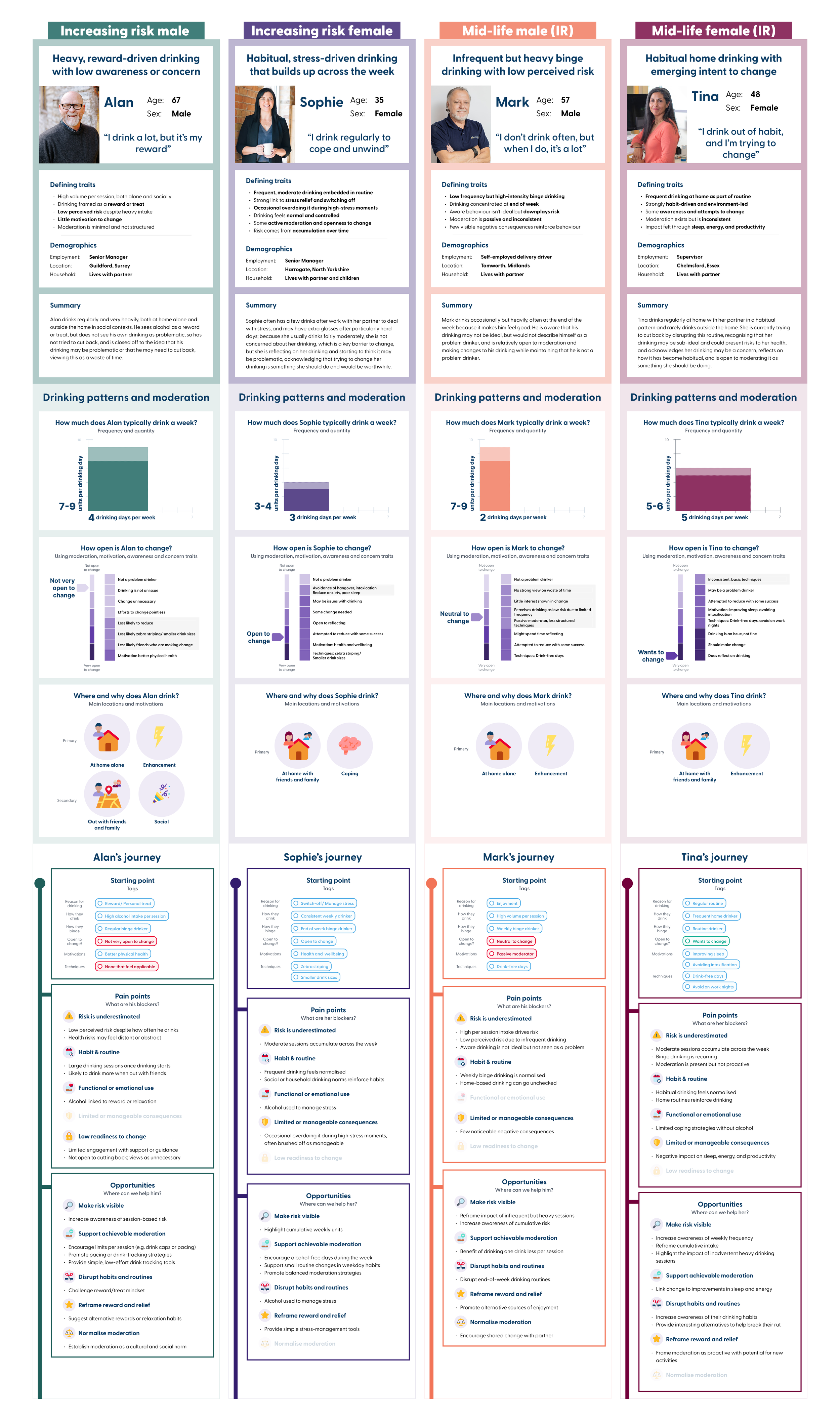
A3 column version of personas (click to expand)
A different kind of persona
Drinkaware's primary audience is increasing risk drinkers, the messy middle where full support services aren't appropriate, but where intervention and education can make a real difference. It's a vast audience though, with many different sub-categories that make individual drinkers very different from each other in how and why they drink, meaning their needs and pain points differ greatly.
The previous Drinkaware personas were organised around drinking motivation, a coping drinker, a social drinker, a conformity drinker. The differences were relatively clear and easy to communicate visually.
The new personas are also increasing risk drinkers, but there was no single easily identifiable difference to anchor them to. The distinctions are behavioural and nuanced, risk recognition, readiness to change, and the wider influences shaping each person's relationship with alcohol. These differences are real and significant, but they're subtle. You can't see them at a glance the way you could with motivation-based personas.
That subtlety became the central design problem.
The data complexity
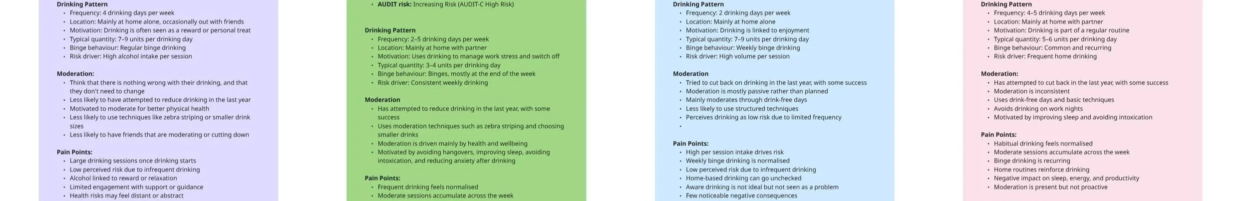
Drinking behaviour is measured in multiple ways simultaneously, sessions per week, units per week, units per session, drinks per session, and these are typical figures, which don't capture occasional binge drinking. Not all of these data points exist for every persona, and not all are directly comparable across the four. Some personas have a motivation to moderate; others don't. The data wasn't symmetrical, and forcing it into a rigid template would have either distorted it or left obvious gaps.
Taking time to properly understand the content before designing anything was essential. I had to know what the data was actually saying before I could make decisions about how to show it.
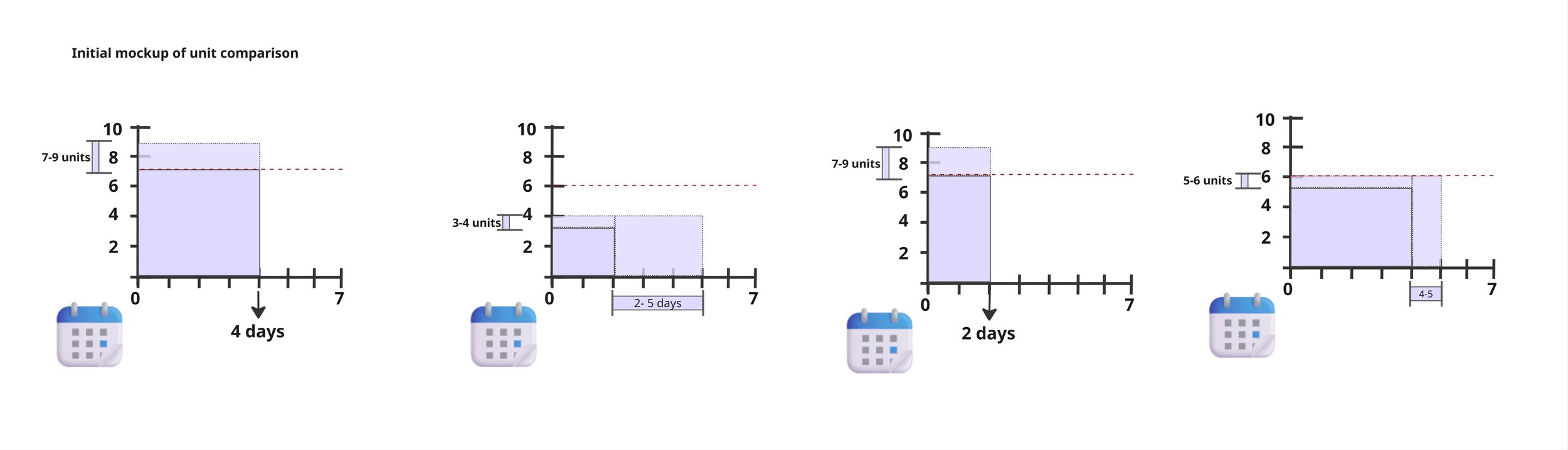
The initial unit comparison mockup
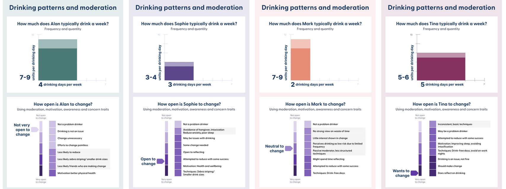
A focus on the “Drinking patterns and moderation” sections; easier to spot the differences when laid our next to each other (click to expand)
The design approach
I started with individual A4 layouts, which would be the natural format for personas used one at a time. But when a rough draft was needed quickly for a planning meeting, I created an A3 landscape version with all four personas in columns side by side, and immediately saw how powerful that format was for this particular set.
Because the differences between these personas are subtle and behavioural rather than obvious and motivation-based, being able to see all four at once changes the experience completely. The nuances that are hard to spot when reading personas one at a time become visible when you can see the same section for each persona side by side. The comparison becomes the default rather than something the reader has to do mentally.
That realisation shaped the rest of the project. I committed to the A3 format as the primary output, with individual A4 versions to follow, giving teams the comparison view for planning and discussion, and the individual view for when a single persona is the focus.
Within each column, consistent information architecture ensures the same type of information always appears in the same position, so the eye can move horizontally across personas without having to reorient with each one. Where data points weren't directly comparable across the four, I designed for that honestly rather than forcing false equivalence.
One practical consideration: when printed at A3, the detail within each column becomes hard to read. For situations where paper versions are needed, the individual A4 layouts will likely be more practical, giving teams the comparison view digitally and the detail view in print.
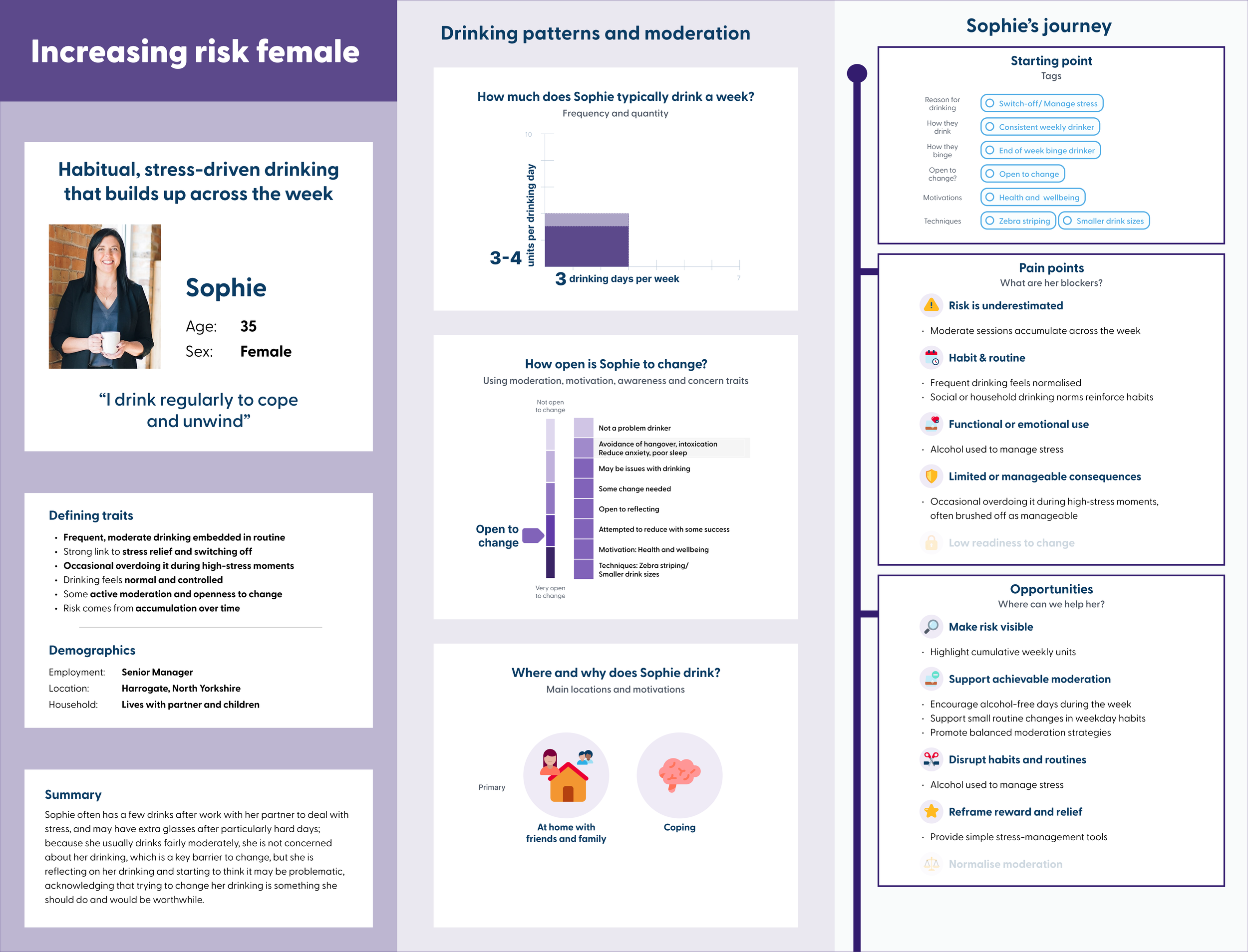
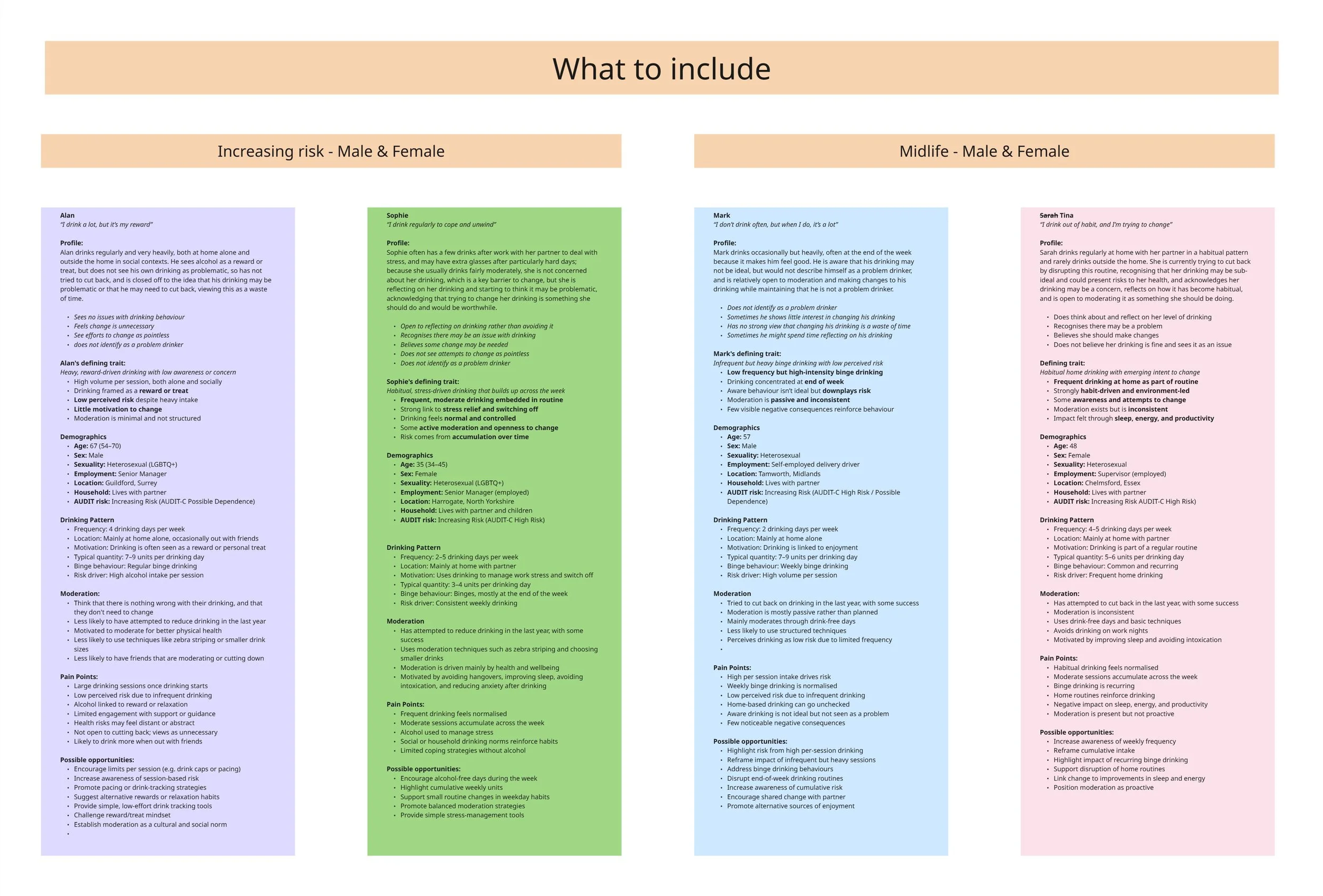
Increasing Risk Female A4 landscape persona
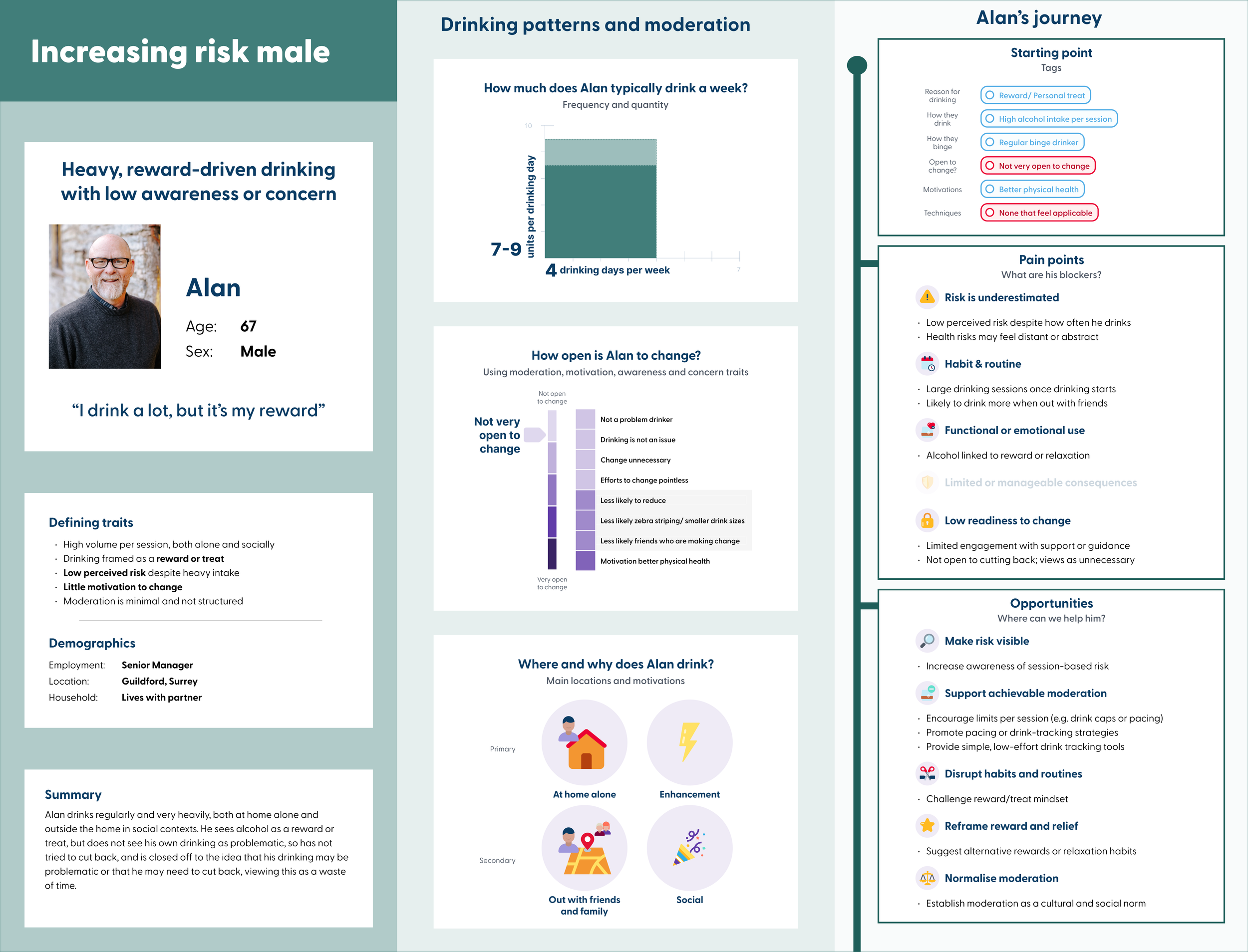
Increasing Risk Male A4 landscape persona
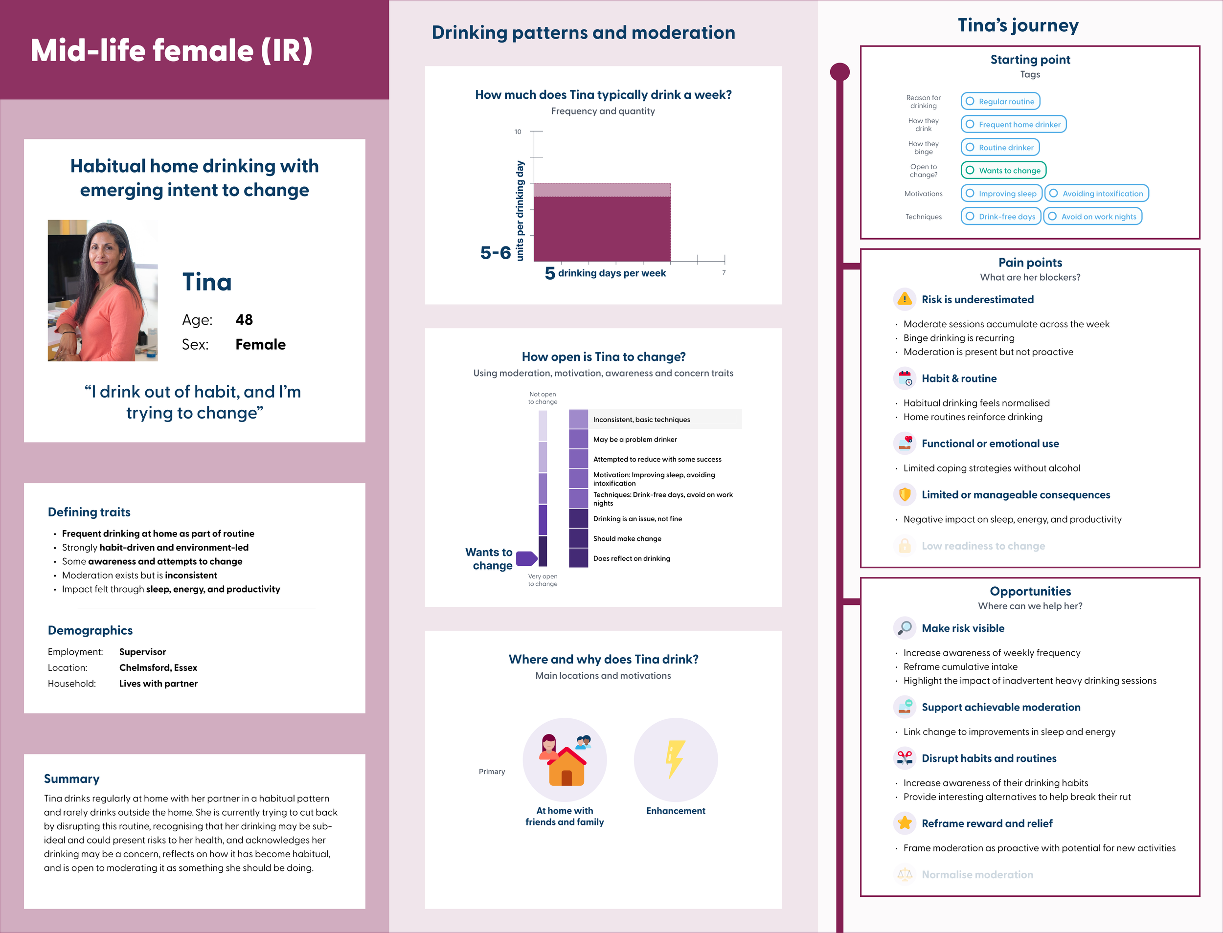
Mid-life (increasing-risk) Female A4 landscape persona
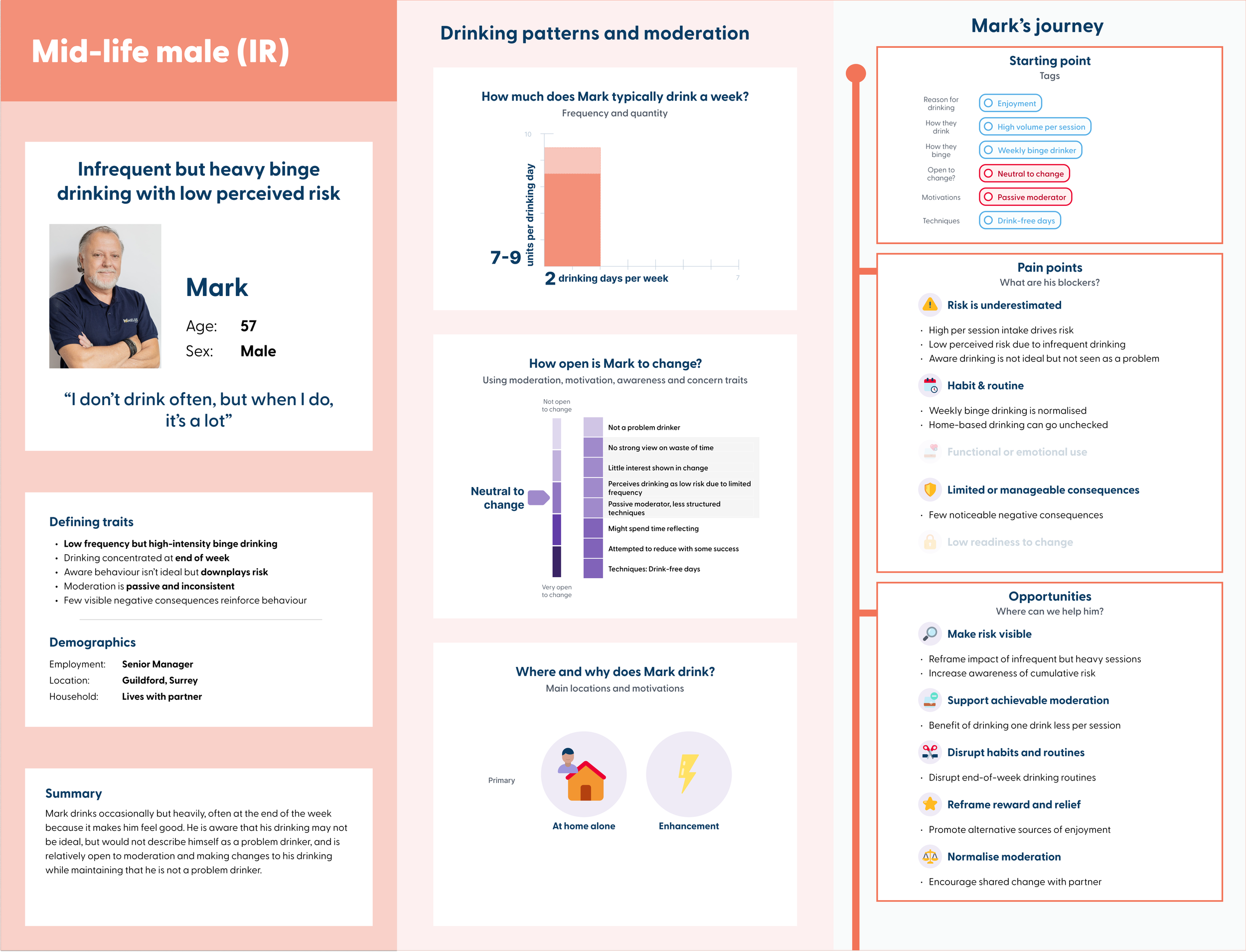
Mid-life (increasing-risk) Male A4 landscape persona
The process
Although the research and content was led by the Senior UX and Research Officer, I didn't wait until everything was handed over before getting involved. I dipped in at key stages during the content development so I could understand the direction early, start thinking about the design challenges ahead, and identify what I would need to address. That included doing my own research into how to represent nuanced behavioural data visually.
When the content arrived as written copy blocks, I reviewed and analysed everything, identified where information was missing or unclear, and went back to ask for more. That iteration between content and design was important, not just checking that the words fitted the layout, but making sure the visual hierarchy reflected what actually mattered most about each persona.
Once initial designs were produced, I fielded feedback from a wider group of stakeholders beyond the core team. That introduced an additional challenge: distinguishing between feedback that was grounded in the research and feedback that reflected personal preference. Where suggestions would have changed aspects of the personas in ways that weren't supported by the data, I referred back to the core research team to confirm the position before pushing back. That diplomatic approach meant any challenge to the suggested changes came from the evidence and the people responsible for it, rather than from me alone, keeping relationships intact while still protecting the integrity of the personas as research artefacts.
The Moderation bullet points I used to create the "Open to change" section
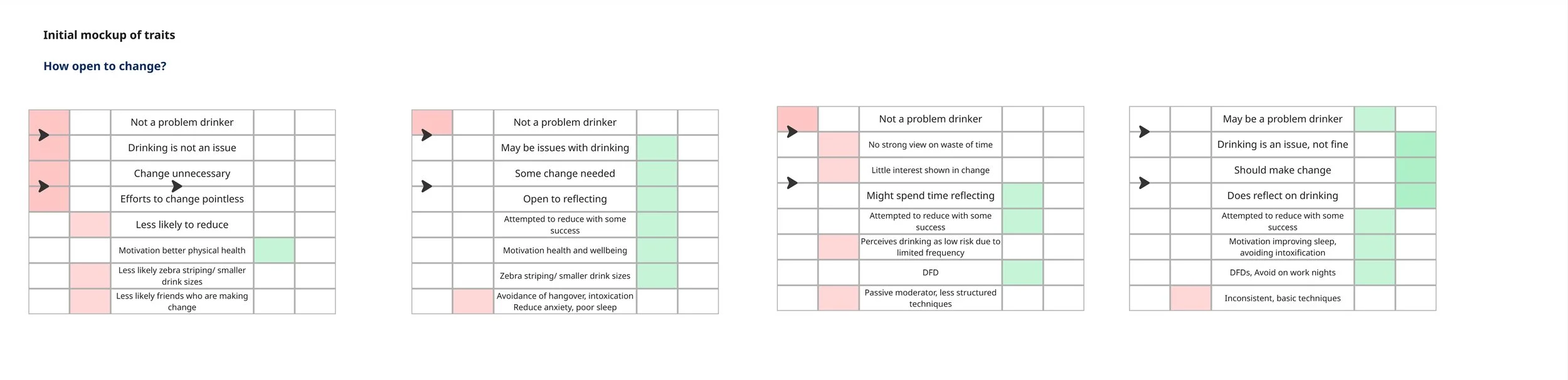
The initial "Open to change" visualisation across personas
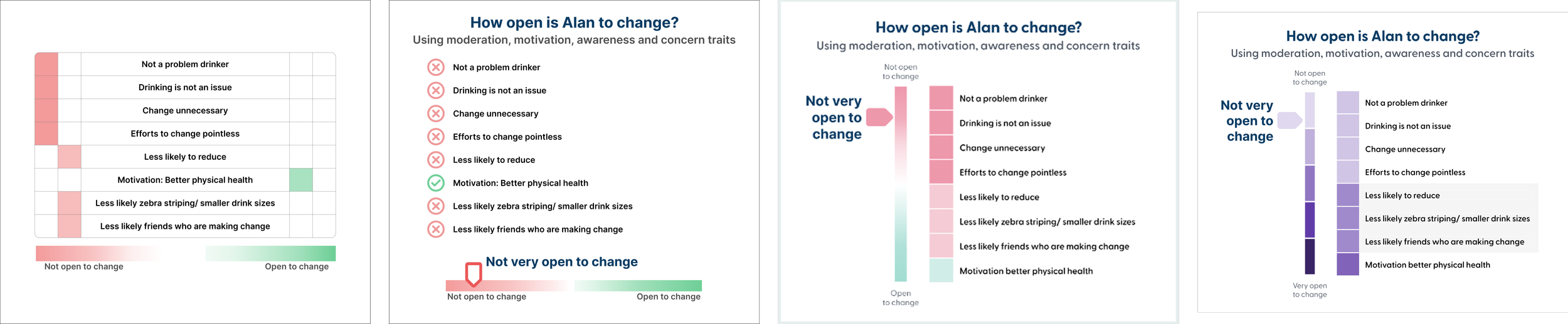
4 different versions of the "Open to change" section to show how it developed
The copy/ building blocks for the personas
Reflection
This project sits at the intersection of research, information design, and communication, which is where I find the most interesting design problems. The difficulty wasn't the visual design itself, it was understanding the content well enough to make good decisions about how to represent it. Getting that understanding took time and required going back to the research owner with questions, dipping into the process early, and pushing back on feedback that wasn't grounded in the data. That felt like the right instinct: you can't design something well if you don't properly understand what it's trying to say.